

Theme Presets#
This page and the theme gallery are the official catalog of published skins and color schemes — a stable product surface, not an experiment. Packages follow the authoring contract below so any skin pairs with any scheme.
Ox Content splits a theme into two independent axes, published as two families of packages:
- Skins (
@ox-content/theme-*) own form — geometry, texture, typography and motion. A skin is written entirely against--octc-*custom properties and never names a color. - Color schemes (
@ox-content/theme-color-*) own color — a light and a dark palette, and nothing else. No layout, no texture, no fonts.
Because neither half knows about the other, any skin pairs with any package: 27 skins × 46 color packages = 1242 package pairings. The gallery also lists named migration variants, for 64 scheme rows × 27 skins = 1728 combinations.
Gallery#
The gallery renders each pairing with the real SSG stylesheet inside an iframe, so what you see is what a built site looks like — including light and dark, the landing page and an article page, and the live WebGL backdrops.
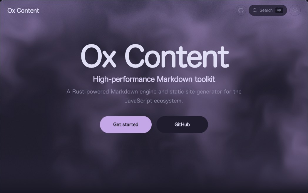
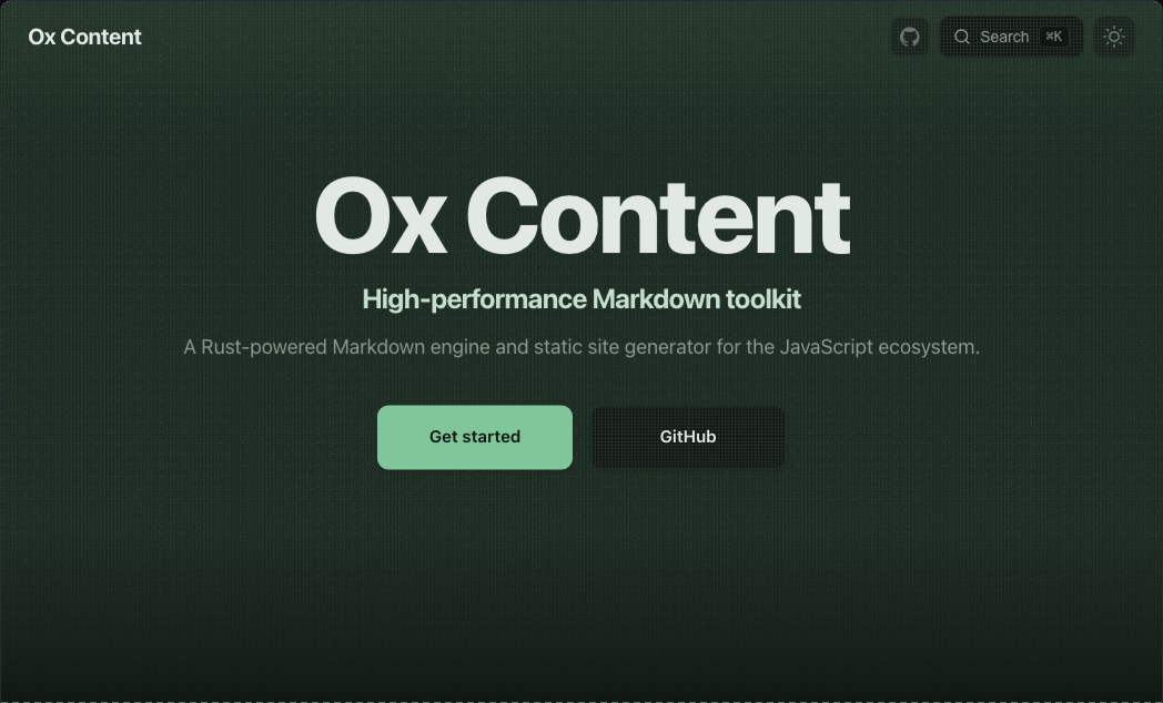
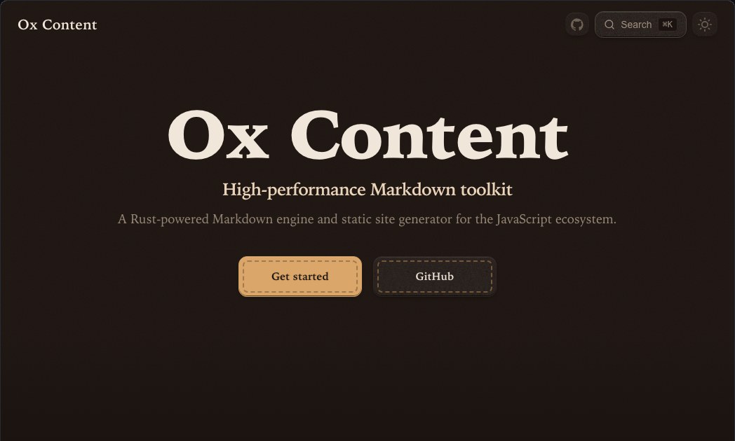
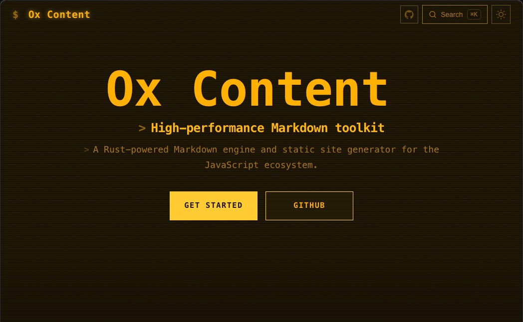
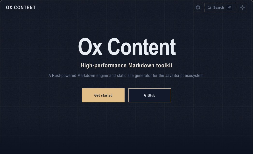
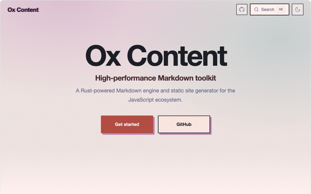
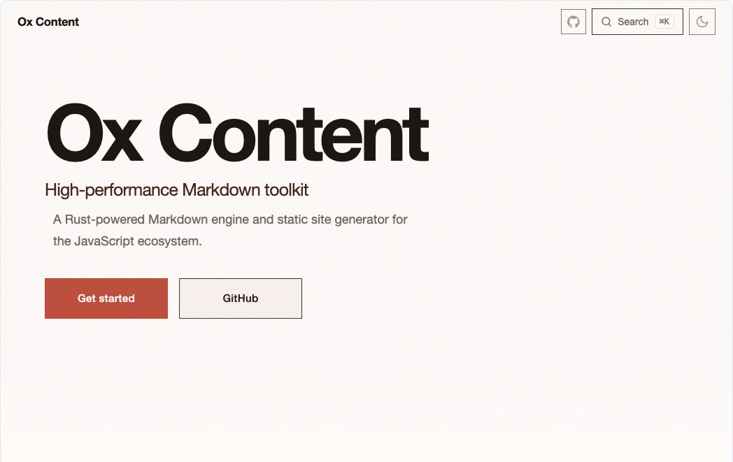
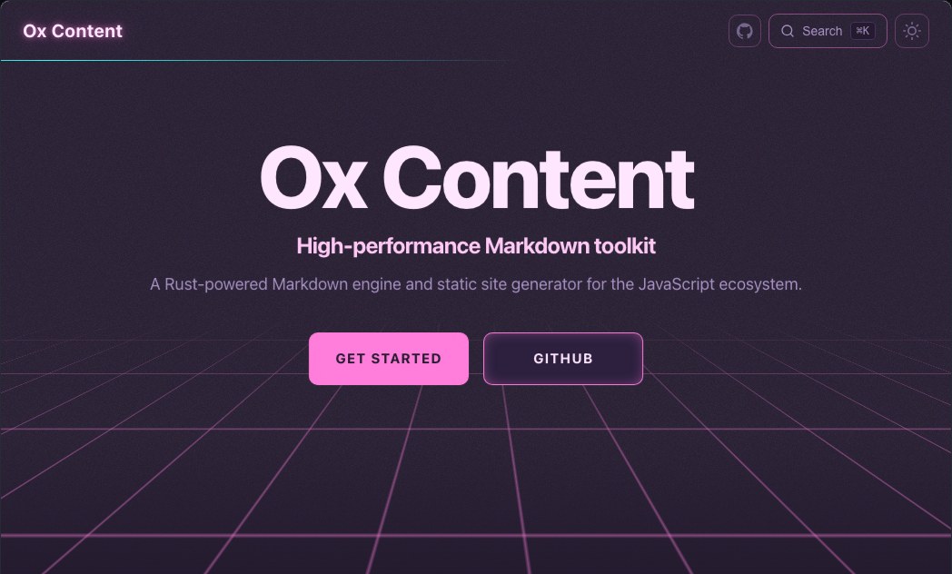
A sample of every skin — each shot with the colour scheme it was designed toward:
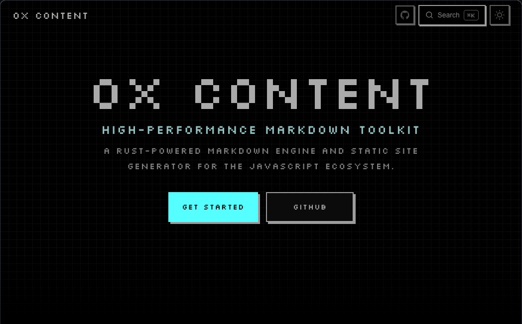 Pixel
Pixel
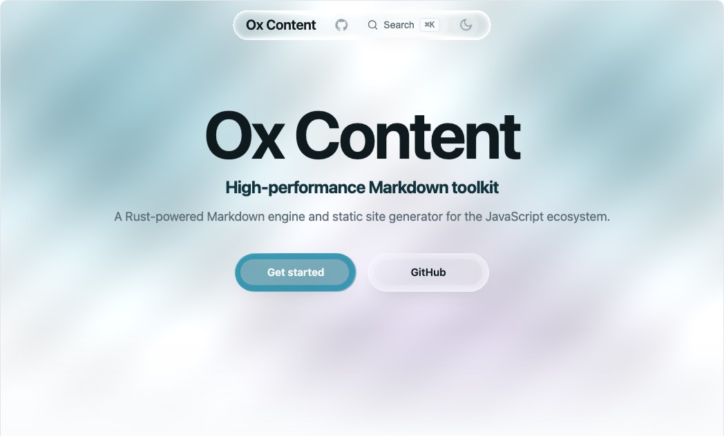 Liquid Glass
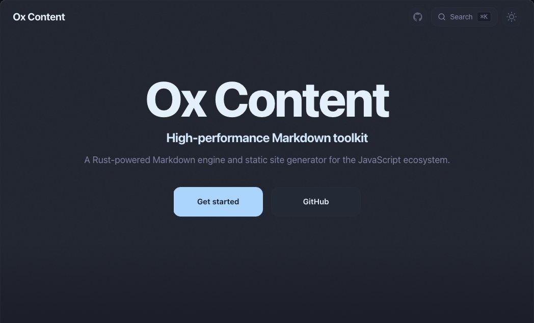 Blur Glass
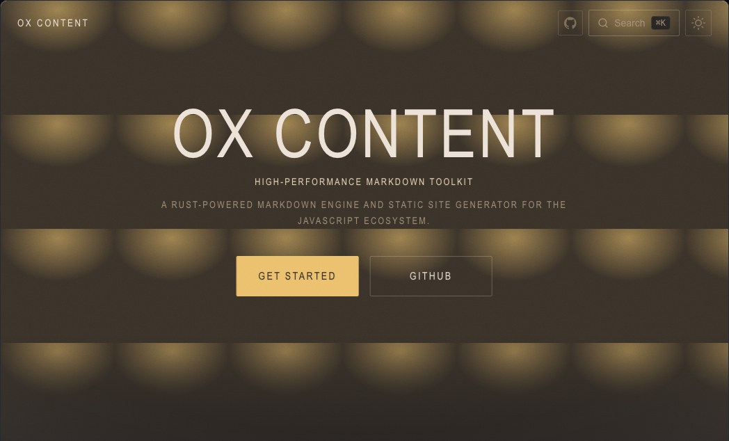 Analog Film
 Fluid
Fluid
 Fabric
 Leather
 Brutalist
 Terminal
 Blueprint
 Risograph
 Swiss
Swiss
 Neon
Neon
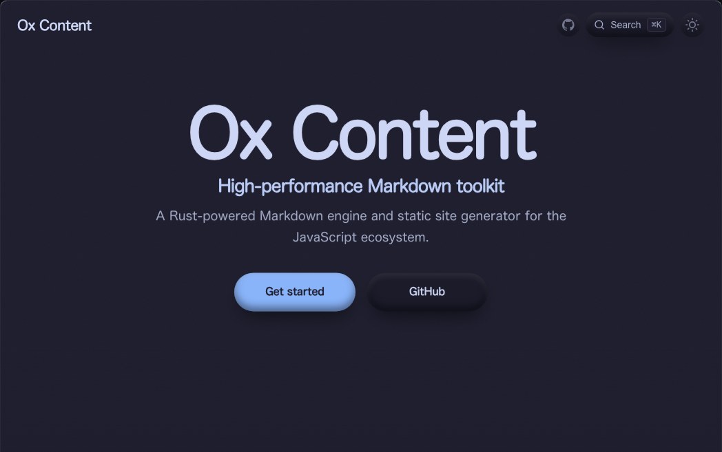 Clay
Clay
 Editorial
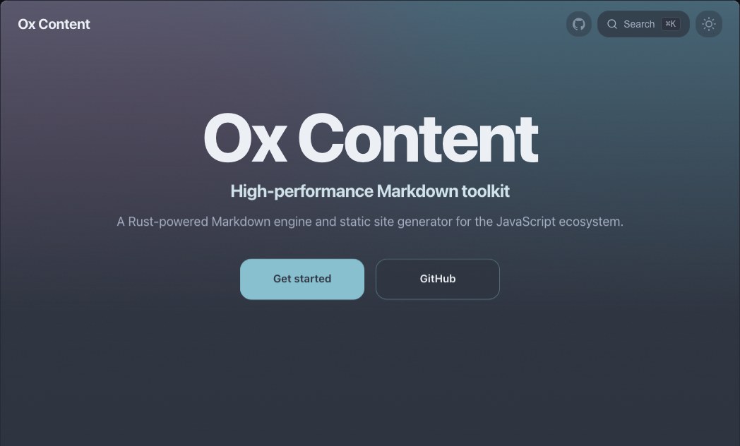 Aurora
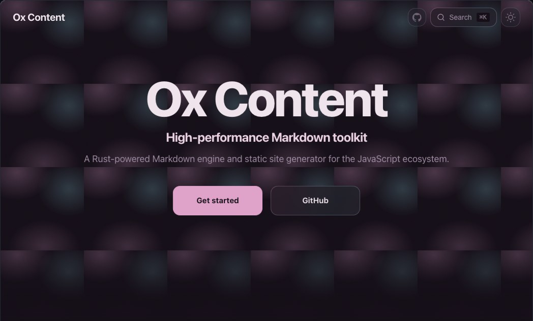 Holo
Holo
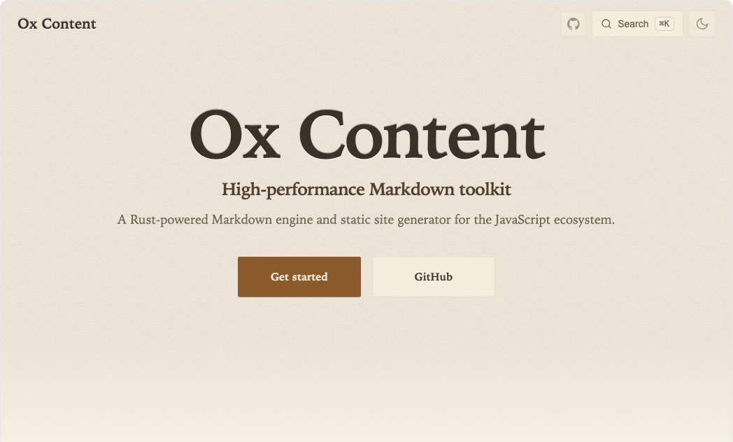 Paper
Paper
 Voltage
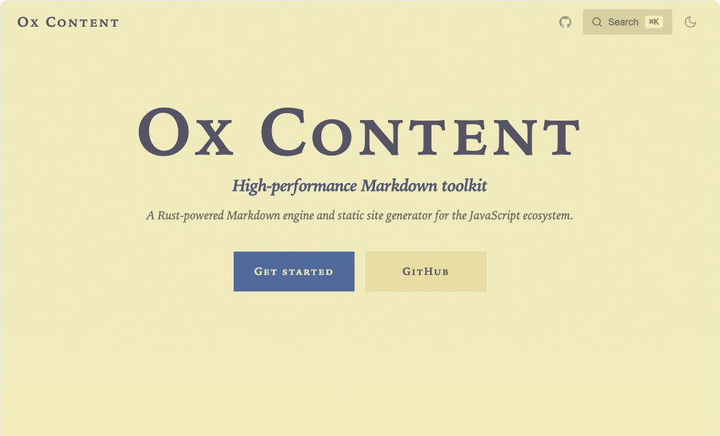 Manuscript
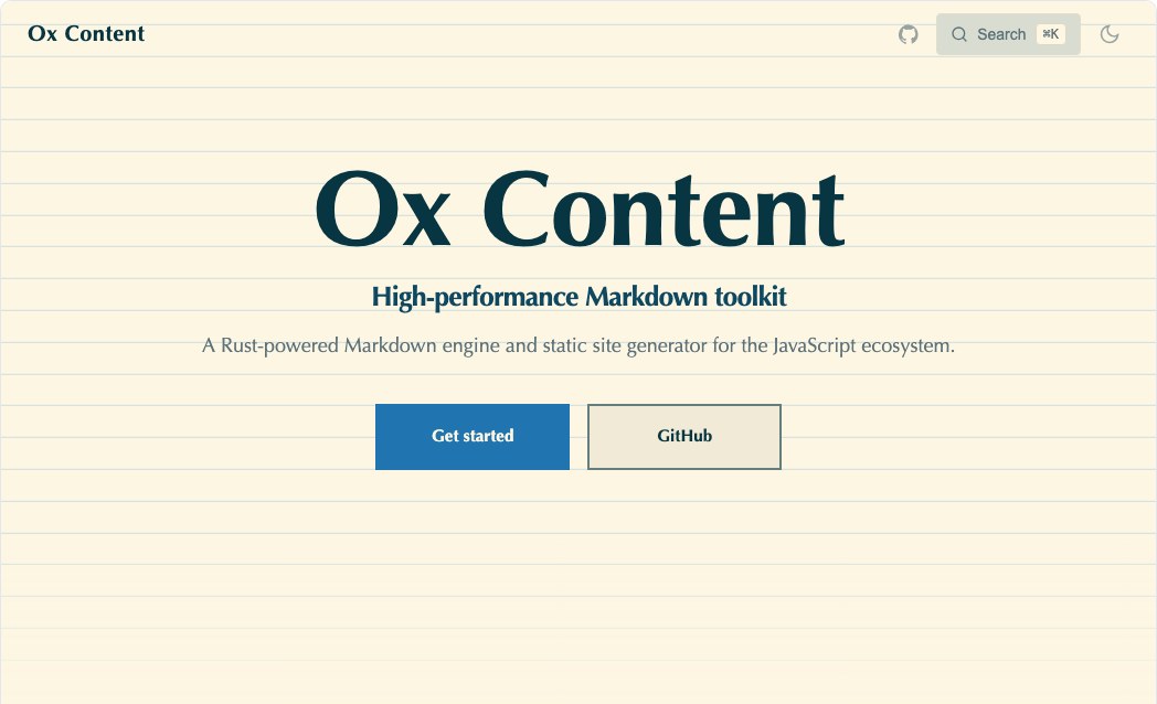 Ledger
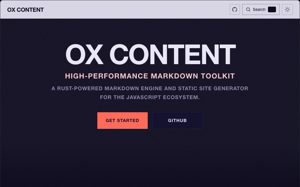 Kiosk
Kiosk
 Atlas
Atlas
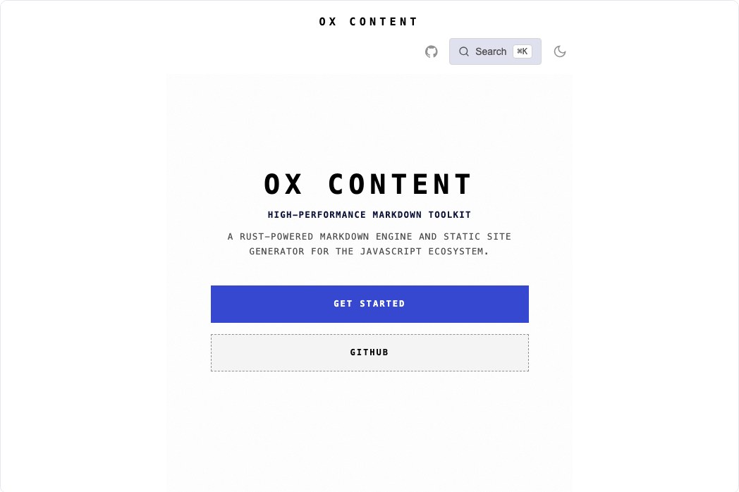 Receipt
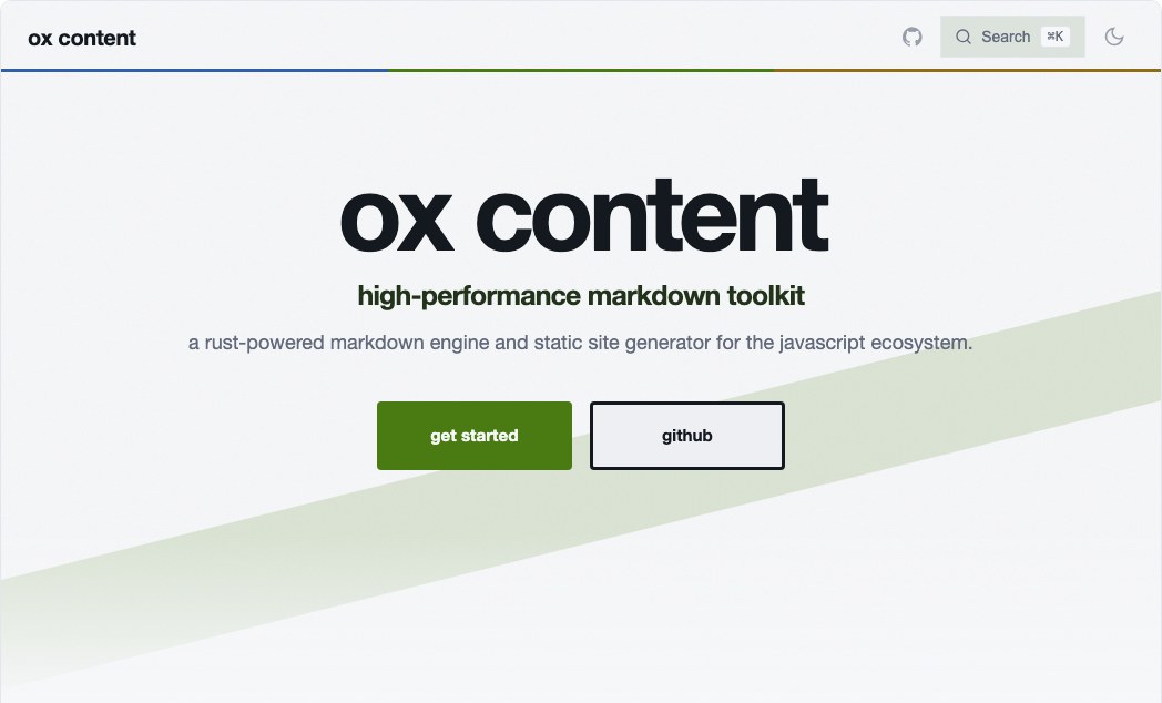 Bauhaus
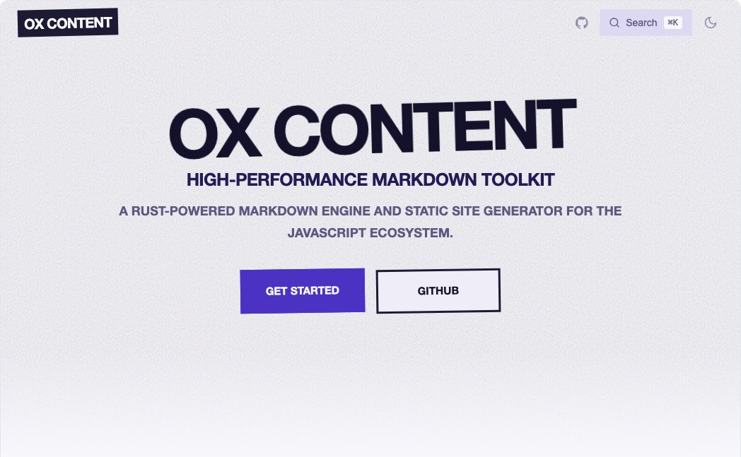 Zine
Zine
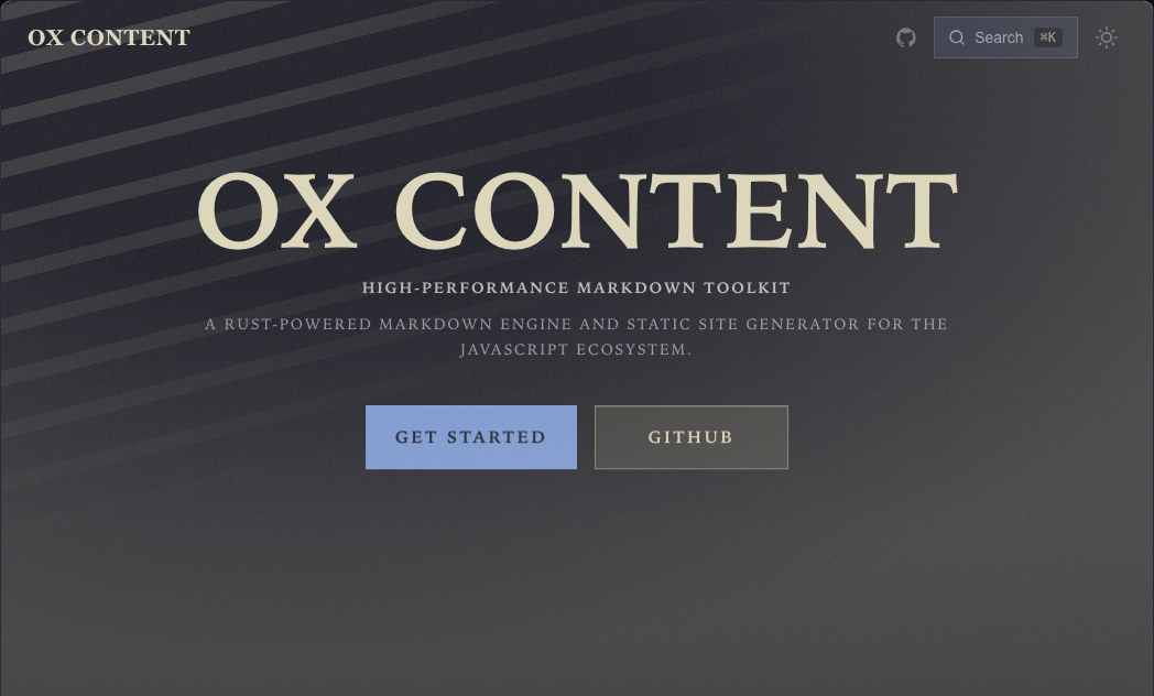 Noir
Noir
Quick start#
Install one of each:
npm install @ox-content/theme-liquid-glass @ox-content/theme-color-tokyo-night
Then list them as layers. theme accepts an array, and layers compose left to
right:
// vite.config.ts
import { defineConfig } from "vite";
import { oxContent } from "@ox-content/vite-plugin";
import liquidGlass from "@ox-content/theme-liquid-glass";
import tokyoNight from "@ox-content/theme-color-tokyo-night";

export default defineConfig({
  plugins: [
    oxContent({
      srcDir: "docs",
      ssg: {
        siteName: "My Docs",
        theme: [liquidGlass, tokyoNight],
      },
    }),
  ],
});
Anything you append wins, so your own overrides go last:
theme: [
  liquidGlass,
  tokyoNight,
  {
    colors: { primary: "#ff5f56" },
    footer: { copyright: "Copyright © 2026 My Company" },
  },
];
Either axis works on its own. A scheme with no skin restyles the default theme; a skin with no scheme reshapes the default palette.
Skins#
Each skin is roughly 6–7 kB of CSS with zero JavaScript and no runtime dependencies.
| Package | Name | Description |
|---|---|---|
@ox-content/theme-pixel |
Pixel | Chunky 8-bit surfaces, hard offset shadows and stepped motion |
@ox-content/theme-liquid-glass |
Liquid Glass | Refractive glass panels with specular edges and a light sweep on hover |
@ox-content/theme-blur-glass |
Blur Glass | Frosted backdrop-blur layers that resolve out of a soft haze |
@ox-content/theme-analog-film |
Analog Film | Grain, halation and sprocket rails with a gentle gate weave |
@ox-content/theme-fluid |
Fluid | Organic blob gradients that drift and morph behind the content |
@ox-content/theme-fabric |
Fabric | Woven texture, stitched seams and soft cloth-fold reveals |
@ox-content/theme-leather |
Leather | Embossed grain and saddle stitching that presses in when touched |
@ox-content/theme-brutalist |
Brutalist | Raw structure, oversized type and shadows that slam into place |
@ox-content/theme-terminal |
Terminal | CRT phosphor with scanlines, a blinking block caret and prompt gutters |
@ox-content/theme-blueprint |
Blueprint | Technical drawing grid with dashed callouts and strokes that draw themselves |
@ox-content/theme-risograph |
Risograph | Misregistered duotone print where the ink channels separate on hover |
@ox-content/theme-swiss |
Swiss | International Typographic Style — a hard grid, rules, and precise slides |
@ox-content/theme-neon |
Neon | Sunset-grid glow with humming tube outlines and a scanline sweep |
@ox-content/theme-clay |
Clay | Soft extruded clay that squishes under the pointer |
@ox-content/theme-editorial |
Editorial | Magazine typography with drop caps, hairline rules and column reveals |
@ox-content/theme-aurora |
Aurora | Slow conic light curtains drifting behind translucent panels |
@ox-content/theme-holo |
Holo | Iridescent foil that shifts hue as panels tilt and slide |
@ox-content/theme-paper |
Paper | Letterpress impressions on soft stock with a deckled page edge |
@ox-content/theme-voltage |
Voltage | Oversized display type with charged gradient edges and a live electric field |
@ox-content/theme-manuscript |
Manuscript | A codex page — narrow measure, rubricated heads, and a table of contents that becomes marginalia |
@ox-content/theme-ledger |
Ledger | A bound accounting book — text set on real ruled lines, tabular figures throughout |
@ox-content/theme-kiosk |
Kiosk | Platform signage — a departure-board sidebar, banded heads and arrows |
@ox-content/theme-atlas |
Atlas | A survey sheet — contour bands, a keyed legend sidebar and registration marks |
@ox-content/theme-receipt |
Receipt | A thermal roll — one narrow centred column, dotted leaders and a torn edge |
@ox-content/theme-bauhaus |
Bauhaus | Circle, square, triangle and a diagonal that refuses the grid |
@ox-content/theme-zine |
Zine | Photocopied and taped together — nothing square to the page |
@ox-content/theme-noir |
Noir | One hard key light and a steep falloff — shapes picked out of the dark |
Color schemes#
Every scheme ships a matched light and dark palette; the built-in header toggle switches between them with no extra configuration.
Preview every color package as paired light and dark surfaces. Each card samples the page background, text, link accent, code background, and syntax accent set for one scheme; open the gallery to try it with any skin.
| Package | Name | Description |
|---|---|---|
@ox-content/theme-color-github |
GitHub | GitHub Light and GitHub Dark |
@ox-content/theme-color-tokyo-night |
Tokyo Night | Tokyo Night Day and Tokyo Night Storm |
@ox-content/theme-color-mono |
Mono | Pure monochrome, zero hue |
@ox-content/theme-color-dracula |
Dracula | Dracula with the Alucard light counterpart |
@ox-content/theme-color-one-dark |
One Dark | Atom One Light and One Dark |
@ox-content/theme-color-retro |
Retro | Warm amber phosphor terminal |
@ox-content/theme-color-snow |
Snow | Crisp snow white over deep slate |
@ox-content/theme-color-catppuccin |
Catppuccin | Catppuccin Latte and Mocha |
@ox-content/theme-color-nord |
Nord | Nord Snow Storm and Polar Night |
@ox-content/theme-color-gruvbox |
Gruvbox | Gruvbox light and dark, medium contrast |
@ox-content/theme-color-rose-pine |
Rosé Pine | Rosé Pine Dawn and Rosé Pine |
@ox-content/theme-color-solarized |
Solarized | Ethan Schoonover's Solarized Light and Dark |
@ox-content/theme-color-everforest |
Everforest | Everforest light and dark, medium contrast |
@ox-content/theme-color-ayu |
Ayu | Ayu Light and Ayu Mirage |
@ox-content/theme-color-vitesse |
Vitesse | Anthony Fu's Vitesse light and dark |
@ox-content/theme-color-night-owl |
Night Owl | Sarah Drasner's Light Owl and Night Owl |
@ox-content/theme-color-monokai |
Monokai | Monokai Pro with a light companion |
@ox-content/theme-color-kanagawa |
Kanagawa | Kanagawa Lotus and Wave |
@ox-content/theme-color-poimandres |
Poimandres | Poimandres, cool teal on deep navy |
@ox-content/theme-color-sepia |
Sepia | Low-glare sepia tuned for long reading sessions |
@ox-content/theme-color-high-contrast |
High Contrast | Maximum-contrast scheme aimed at WCAG AAA body text |
@ox-content/theme-color-synthwave |
Synthwave | Sunset-grid synthwave with hot magenta accents |
@ox-content/theme-color-voltage |
Voltage | High-voltage accents over a near-black canvas |
@ox-content/theme-color-flexoki |
Flexoki | Ink and paper, tuned for e-ink-like calm |
@ox-content/theme-color-iceberg |
Iceberg | Cold, quiet blues borrowed from the vim scheme |
@ox-content/theme-color-zenburn |
Zenburn | The classic low-contrast scheme for long sessions |
@ox-content/theme-color-oceanic |
Oceanic | Oceanic Next — deep slate teal |
@ox-content/theme-color-palenight |
Palenight | Material Palenight — soft indigo |
@ox-content/theme-color-material |
Material | Material Theme Lighter and Material Theme |
@ox-content/theme-color-horizon |
Horizon | Warm coral and plum at dusk |
@ox-content/theme-color-modus |
Modus | Protesilaos' accessibility-first scheme, WCAG AAA throughout |
@ox-content/theme-color-melange |
Melange | Muted earth tones, warm and unhurried |
@ox-content/theme-color-graphite |
Graphite | Off-black and off-white with one electric accent |
@ox-content/theme-color-sand |
Sand | Warm neutral stone with terracotta |
@ox-content/theme-color-moss |
Moss | Deep forest and paper cream |
@ox-content/theme-color-slate |
Slate | Cool grey with an electric lime edge |
@ox-content/theme-color-plum |
Plum | Aubergine and blush |
@ox-content/theme-color-ink |
Ink | Deep navy with warm sand |
@ox-content/theme-color-porcelain |
Porcelain | Soft warm white with muted blue-grey |
@ox-content/theme-color-cacao |
Cacao | Warm dark chocolate with caramel |
@ox-content/theme-color-coral |
Coral | Warm off-white with coral and teal |
@ox-content/theme-color-arctic |
Arctic | Cold white with glacier cyan |
@ox-content/theme-color-fuji |
Fuji | Mountain festival poster — forest, dawn orange and open sky |
@ox-content/theme-color-stage |
Stage | Event poster — deep indigo with coral and acid yellow |
@ox-content/theme-color-emerald |
Emerald | Vivid green over deep slate — the conference-badge palette |
@ox-content/theme-color-commander |
Commander | CGA cyan panels by day, the bare console prompt by night |
Shiki Migration Presets#
Ox Content 3 highlights code with its native tree-sitter highlighter only. It
does not restore the Shiki runtime, highlightTheme, TextMate grammars, or a
second highlighting engine. The table below maps official
@shikijs/themes@4.4.3 IDs (MIT) to full Ox Content ThemeConfig exports.
Each export remains a paired light/dark theme. When Shiki ships only one side
of a family, the pairing column names the stable companion Ox Content uses.
Syntax colors are mapped to Ox Content semantic roles (comment,
punctuation, keyword, string, constant, function, parameter, and
link); exact TextMate scope fidelity is intentionally out of scope.
| Shiki theme ID | Ox Content package | Export | Pairing | Notes |
|---|---|---|---|---|
github-light |
@ox-content/theme-color-github |
githubClassic |
GitHub Light + GitHub Dark | - |
github-dark |
@ox-content/theme-color-github |
githubClassic |
GitHub Light + GitHub Dark | - |
github-light-default |
@ox-content/theme-color-github |
githubDefault |
GitHub Light Default + GitHub Dark Default | - |
github-dark-default |
@ox-content/theme-color-github |
githubDefault |
GitHub Light Default + GitHub Dark Default | - |
github-dark-dimmed |
@ox-content/theme-color-github |
githubDimmed |
GitHub Light Default + GitHub Dark Dimmed | - |
github-light-high-contrast |
@ox-content/theme-color-github |
githubHighContrast |
GitHub Light High Contrast + GitHub Dark High Contrast | - |
github-dark-high-contrast |
@ox-content/theme-color-github |
githubHighContrast |
GitHub Light High Contrast + GitHub Dark High Contrast | - |
dracula |
@ox-content/theme-color-dracula |
dracula |
Dracula Alucard light companion + Dracula | - |
dracula-soft |
@ox-content/theme-color-dracula |
draculaSoft |
Dracula Alucard light companion + Dracula Soft | The light side keeps Ox Content's existing Alucard companion because @shikijs/themes only ships dark Dracula variants. |
one-light |
@ox-content/theme-color-one-dark |
oneDarkPro |
One Light + One Dark Pro | - |
one-dark-pro |
@ox-content/theme-color-one-dark |
oneDarkPro |
One Light + One Dark Pro | - |
catppuccin-latte |
@ox-content/theme-color-catppuccin |
catppuccin |
Catppuccin Latte + Catppuccin Mocha | - |
catppuccin-mocha |
@ox-content/theme-color-catppuccin |
catppuccin |
Catppuccin Latte + Catppuccin Mocha | - |
catppuccin-frappe |
@ox-content/theme-color-catppuccin |
catppuccinFrappe |
Catppuccin Latte + Catppuccin Frappé | - |
catppuccin-macchiato |
@ox-content/theme-color-catppuccin |
catppuccinMacchiato |
Catppuccin Latte + Catppuccin Macchiato | - |
gruvbox-light-medium |
@ox-content/theme-color-gruvbox |
gruvbox |
Gruvbox Light Medium + Gruvbox Dark Medium | - |
gruvbox-dark-medium |
@ox-content/theme-color-gruvbox |
gruvbox |
Gruvbox Light Medium + Gruvbox Dark Medium | - |
gruvbox-light-hard |
@ox-content/theme-color-gruvbox |
gruvboxHard |
Gruvbox Light Hard + Gruvbox Dark Hard | - |
gruvbox-dark-hard |
@ox-content/theme-color-gruvbox |
gruvboxHard |
Gruvbox Light Hard + Gruvbox Dark Hard | - |
gruvbox-light-soft |
@ox-content/theme-color-gruvbox |
gruvboxSoft |
Gruvbox Light Soft + Gruvbox Dark Soft | - |
gruvbox-dark-soft |
@ox-content/theme-color-gruvbox |
gruvboxSoft |
Gruvbox Light Soft + Gruvbox Dark Soft | - |
rose-pine-dawn |
@ox-content/theme-color-rose-pine |
rosePine |
Rosé Pine Dawn + Rosé Pine | - |
rose-pine |
@ox-content/theme-color-rose-pine |
rosePine |
Rosé Pine Dawn + Rosé Pine | - |
rose-pine-moon |
@ox-content/theme-color-rose-pine |
rosePineMoon |
Rosé Pine Dawn + Rosé Pine Moon | - |
solarized-light |
@ox-content/theme-color-solarized |
solarized |
Solarized Light + Solarized Dark | - |
solarized-dark |
@ox-content/theme-color-solarized |
solarized |
Solarized Light + Solarized Dark | - |
ayu-light |
@ox-content/theme-color-ayu |
ayu |
Ayu Light + Ayu Mirage | - |
ayu-mirage |
@ox-content/theme-color-ayu |
ayu |
Ayu Light + Ayu Mirage | - |
ayu-dark |
@ox-content/theme-color-ayu |
ayuDark |
Ayu Light + Ayu Dark | - |
vitesse-light |
@ox-content/theme-color-vitesse |
vitesse |
Vitesse Light + Vitesse Dark | - |
vitesse-dark |
@ox-content/theme-color-vitesse |
vitesse |
Vitesse Light + Vitesse Dark | - |
vitesse-black |
@ox-content/theme-color-vitesse |
vitesseBlack |
Vitesse Light + Vitesse Black | - |
night-owl-light |
@ox-content/theme-color-night-owl |
nightOwl |
Light Owl + Night Owl | - |
night-owl |
@ox-content/theme-color-night-owl |
nightOwl |
Light Owl + Night Owl | - |
kanagawa-lotus |
@ox-content/theme-color-kanagawa |
kanagawa |
Kanagawa Lotus + Kanagawa Wave | - |
kanagawa-wave |
@ox-content/theme-color-kanagawa |
kanagawa |
Kanagawa Lotus + Kanagawa Wave | - |
kanagawa-dragon |
@ox-content/theme-color-kanagawa |
kanagawaDragon |
Kanagawa Lotus + Kanagawa Dragon | - |
material-theme-lighter |
@ox-content/theme-color-material |
material |
Material Theme Lighter + Material Theme | - |
material-theme |
@ox-content/theme-color-material |
material |
Material Theme Lighter + Material Theme | - |
material-theme-darker |
@ox-content/theme-color-material |
materialDarker |
Material Theme Lighter + Material Theme Darker | - |
material-theme-ocean |
@ox-content/theme-color-material |
materialOcean |
Material Theme Lighter + Material Theme Ocean | - |
material-theme-palenight |
@ox-content/theme-color-material |
materialPalenight |
Material Theme Lighter + Material Theme Palenight | - |
horizon |
@ox-content/theme-color-horizon |
horizon |
Ox Content light companion + Horizon | - |
horizon-bright |
@ox-content/theme-color-horizon |
horizonBright |
Horizon Bright + Horizon | - |
Syntax highlighting#
Highlighting follows the color scheme in both modes, with no extra
configuration. The native tree-sitter highlighter emits token colors as
--octc-syntax-* custom properties and each scheme defines them per mode —
one build, two palettes.
Schemes pick syntax colors against the code background, not the page
background. Several light schemes (mono, snow, nord, retro, monokai,
poimandres, synthwave) deliberately keep a dark code block in light mode; a
fixed theme would put dark token colors on it and make it unreadable.
With no scheme installed the properties fall back to GitHub Dark.
Override individual tokens like any other token:
theme: [pixel, tokyoNight, { darkTokens: { "syntax-token-comment": "#5a6a8a" } }];
Motion#
Presets are motion-first, and all of it is declarative CSS:
- Cross-document page transitions via
@view-transition { navigation: auto }. The header and sidebar are givenview-transition-names so they hold still while the article swaps — an app-like feel with no router and no client bundle. - Scroll-driven reveals via
animation-timeline: view(). Headings, code blocks, tables and feature cards rise as they enter, with the feature grid staggered by column. - Dialog entry via
@starting-style, so the search modal animates open without a JavaScript-toggled class.
Everything sits behind @supports, so an engine that lacks a feature simply
renders the finished, static state — the un-animated state is never a hidden
one. All of it is disabled under prefers-reduced-motion: reduce.
Retune the choreography without touching CSS. Every skin exposes its timing as tokens:
| Token | Purpose |
|---|---|
--octc-motion-fast |
Color and background transitions |
--octc-motion-base |
Elevation, transform, page swap |
--octc-motion-slow |
Hero entrance, specular sweeps |
--octc-motion-ease |
The skin's signature easing curve |
--octc-motion-spring |
Overshoot curve for lifts and presses |
--octc-motion-rise |
Distance a revealed block travels |
theme: [liquidGlass, tokyoNight, { tokens: { "motion-base": "200ms", "motion-ease": "linear" } }];
Live backdrops#
Three skins render their hero backdrop on the GPU instead of faking it in CSS:
| Skin | What it renders |
|---|---|
liquid-glass |
True refraction — a rounded-rect SDF per panel bends a procedural wallpaper toward each panel centre along a spherical-bevel profile, with a chromatic split at the rim |
fluid |
Dye advected through a curl-noise velocity field, which is divergence-free and so reads as an incompressible liquid |
fabric |
A woven height field lit by a drifting key light, so threads catch the light along their own direction |
All three are hand-written WebGL2 with no dependencies — no Three.js, no
bundle, nothing to install. They ship inside the theme's own js, which the SSG
emits as one inline script.
They are strictly progressive enhancement, and every one of these leaves the page exactly as it renders without JavaScript:
prefers-reduced-motion: reduce— never starts- No WebGL2 context, or a shader that fails to compile — never starts
- Hero scrolled out of view, or tab backgrounded — stops drawing
- Any error at all — swallowed, since the CSS backdrop underneath is the design
Colors are read from the live palette through the same --octc-* properties, so
a backdrop follows its color scheme and re-reads on every theme toggle.
Custom tokens#
tokens and darkTokens set any --octc-* custom property, keyed without the
prefix. They merge key-by-key across layers, so overriding one value never means
redeclaring the rest:
theme: [
  liquidGlass,
  tokyoNight,
  {
    tokens: { "surface-glass": "#f8fafc", "code-line-add": "rgba(0,200,120,.18)" },
    darkTokens: { "surface-glass": "#0c1324" },
  },
];
Token names are validated at build time — a name that could break out of its declaration block fails the build rather than shipping a corrupt stylesheet.
How composition works#
resolveTheme flattens every layer's extends chain, then merges the result:
- Object fields (
colors,tokens,layout,fonts, …) merge key-by-key, last layer winning. cssandjsconcatenate in layer order — overwriting them would discard one half of a skin + scheme stack. Identical fragments are joined once, so a layer reached through both an array and anextendschain is not emitted twice.
That ordering is why a skin declares its surface variables through tokens
rather than raw css: tokens resolve declaratively before any stylesheet runs,
which keeps the outcome independent of the order you list the packages in.
Authoring a package#
A preset is a plain ThemeConfig — there is no plugin API to
implement. A skin sets css, fonts, layout and motion tokens; a scheme
sets colors, darkColors, tokens and darkTokens. New packages must meet
the compatibility contract below so they compose with every other published
layer.
Compatibility#
- Light and dark. Color schemes must export a
ThemeConfig(default or named) with bothcolorsanddarkColors. Required palette keys:primary,background,text,textMuted,border,codeBackground, andcodeText. Catalog schemes also shipprimaryHoverandbackgroundAlt. - Required syntax tokens. Schemes must define highlighter tokens under
tokensanddarkTokens: at leastsyntax-foreground,syntax-background, and severalsyntax-token-*keys. These become--octc-syntax-*custom properties that theme-color packages resolve. - Skins must not hard-code colors. A skin owns form, not palette. Do not
put hex or rgb values in
ThemeConfig.colors/darkColors. CSS variables and omitted color fields are allowed. Incss, reference--octc-color-*and--octc-accent-*, and usecolor-mix()for tints. Neutral black/white alpha for depth is fine. - Compose left to right. List layers in
ssg.themeas an array. Object fields merge key-by-key;cssandjsconcatenate. Later layers win. - Screenshot. Include a screenshot of the skin (or a representative pairing) for the gallery above.
import { defineTheme } from "@ox-content/vite-plugin";

export default defineTheme({
  name: "my-skin",
  fonts: { sans: "Inter, system-ui, sans-serif" },
  tokens: { "motion-base": "260ms", "motion-ease": "cubic-bezier(.2,0,0,1)" },
  css: `.header { border-bottom: 2px solid var(--octc-color-primary); }`,
});
Default theme quality#
The built-in stylesheet (ssg.css) is the quality floor every skin and scheme
composes onto. Override these tokens instead of hardcoding a second set of
values:
| Token | Role |
|---|---|
--octc-focus-ring / --octc-focus-offset |
Shared :focus-visible ring |
--octc-motion-base / --octc-motion-ease |
Default motion; off under prefers-reduced-motion |
--octc-code-pad-* / --octc-table-cell-pad-* |
Code frame and table cell spacing |
--octc-touch-target |
Mobile nav hit area |
--octc-color-on-primary |
Ink on brand fills (hero, announcement) |
--octc-color-tip / --octc-color-warning / --octc-color-danger |
Status chrome |
html smooth-scrolling is gated behind prefers-reduced-motion: no-preference.
Code-line dim blur and nav chevron transitions turn off when motion is reduced.
PR benchmarks still report default theme CSS/JS size — prefer retuning these
tokens over adding chrome.
Out of scope here: self-hosted fonts, Iconify CSS, tweet/full-card styling, print stylesheets, and per-skin gallery screenshot refreshes. File those as focused follow-ups when they regress.