
テーマプリセット#
このページと テーマギャラリー が、公開済みスキンと配色の 公式カタログ です。実験ではなく、安定した製品面です。パッケージは下の 執筆契約 に従うので、どのスキンもどの配色と組めます。
Ox Content はテーマを独立した 2 軸に分け、2 系統のパッケージとして公開します。
- スキン (
@ox-content/theme-*) は 形 を持ちます。幾何、質感、タイポ、モーション。スキンはすべて--octc-*カスタムプロパティに対して書き、色名を直書きしません。 - 配色 (
@ox-content/theme-color-*) は 色 を持ちます。ライトとダークのパレットだけ。レイアウトも質感もフォントも持ちません。
どちらも相手を知らないので、どのスキンもどの配色パッケージとも組めます。27 スキン × 46 配色パッケージ = 1242 通り です。ギャラリーには named migration variant も並べるので、64 scheme row × 27 スキン = 1728 通り を確認できます。
ギャラリー#
ギャラリーは本物の SSG スタイルシートを iframe 内で描画するので、見た目はビルドしたサイトそのものです。ライトとダーク、ランディングと記事ページ、ライブの WebGL 背景も含みます。
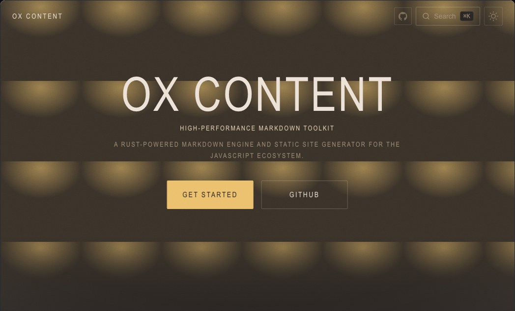
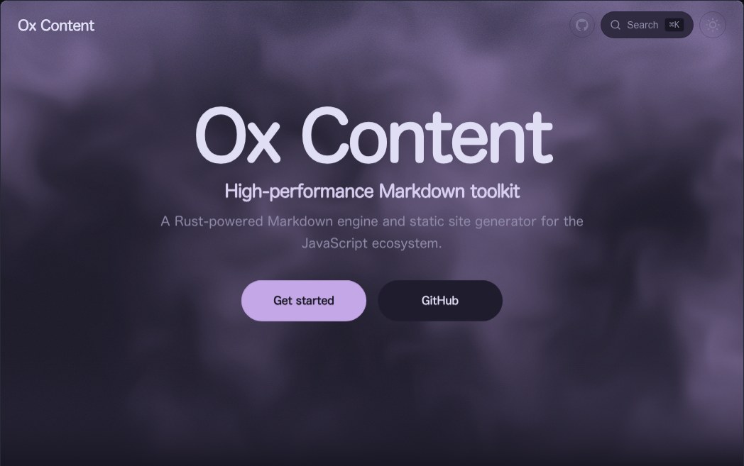
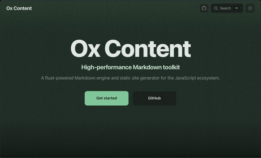
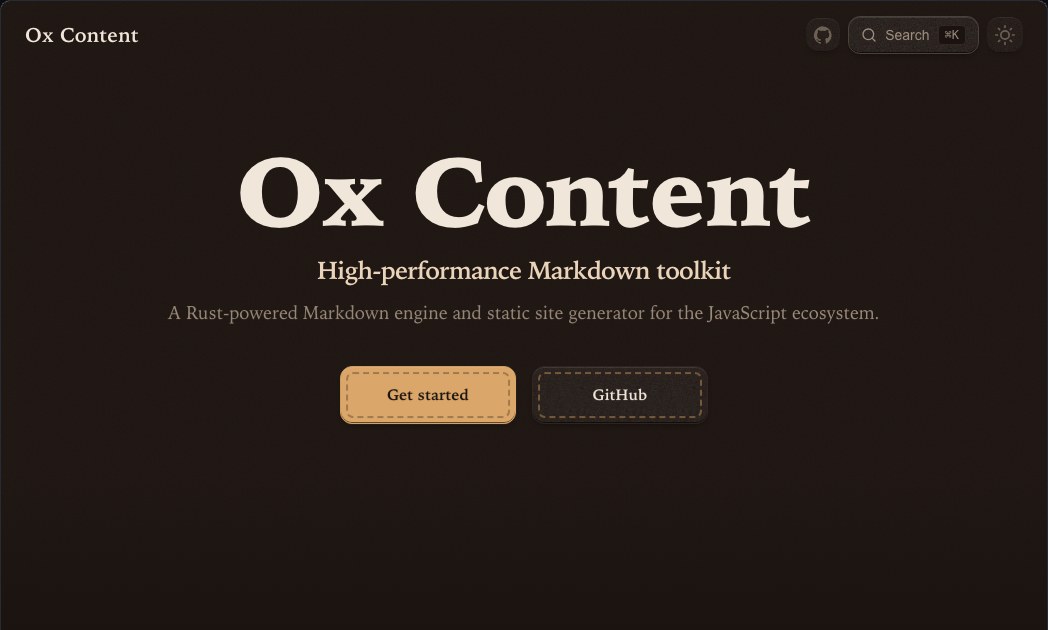
各スキンの見本です。それぞれ、想定した配色で撮っています。
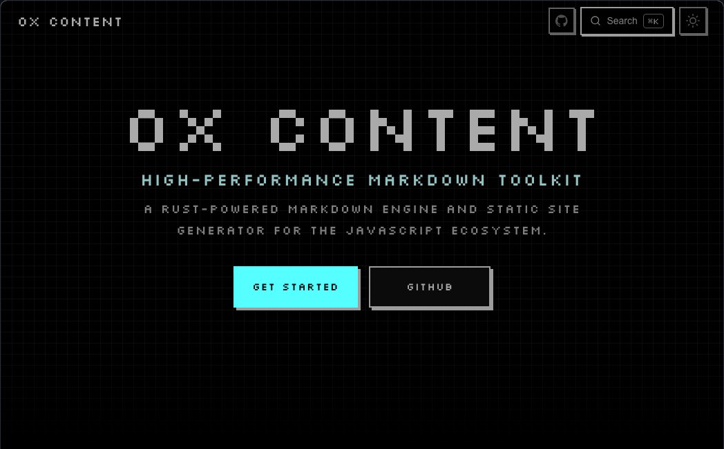 Pixel
Pixel
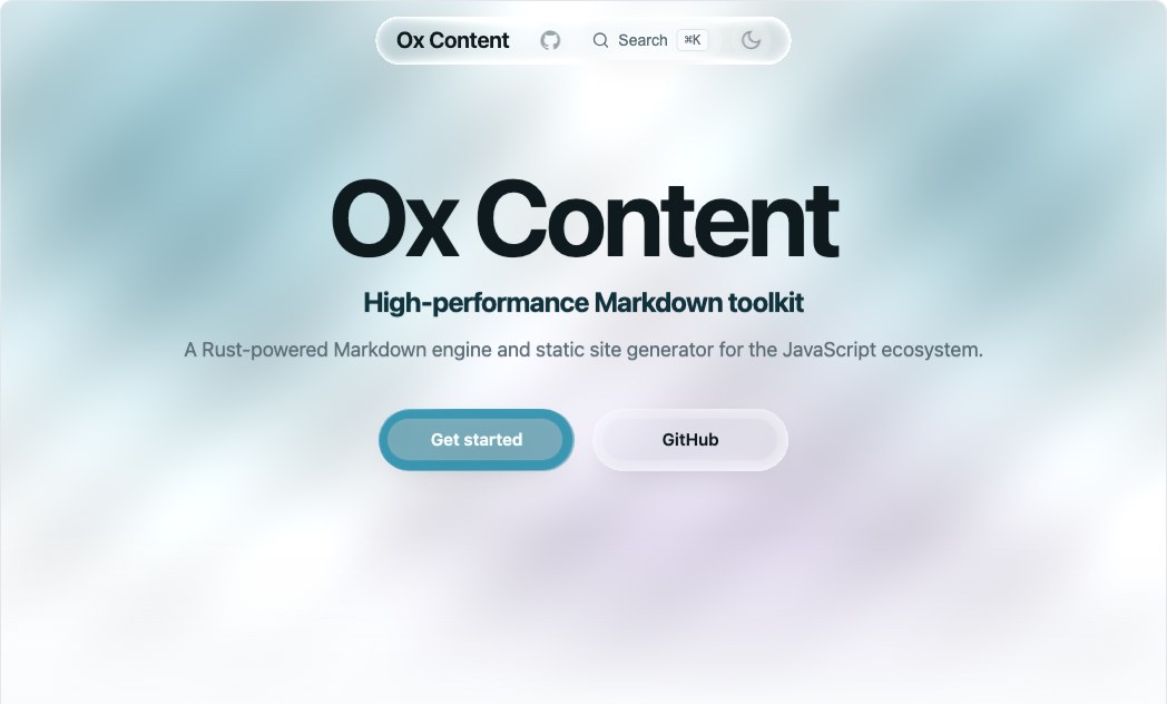 Liquid Glass
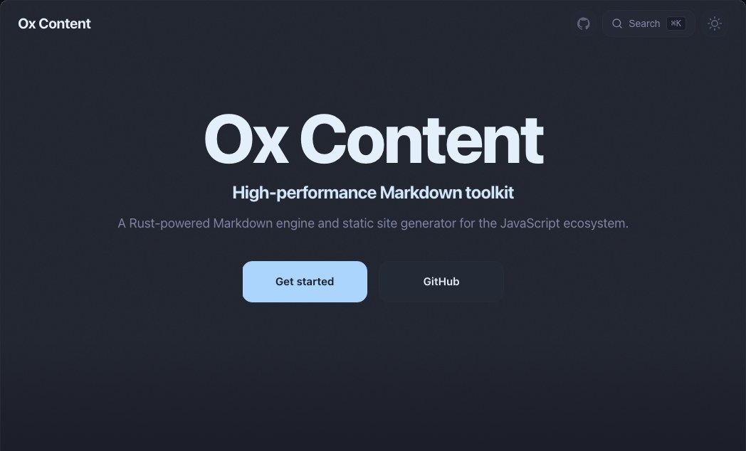 Blur Glass
 Analog Film
 Fluid
Fluid
 Fabric
 Leather
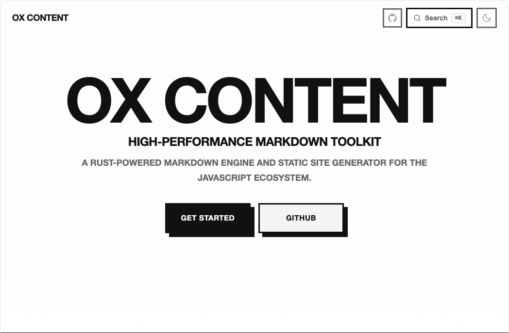 Brutalist
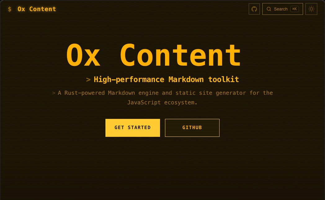 Terminal
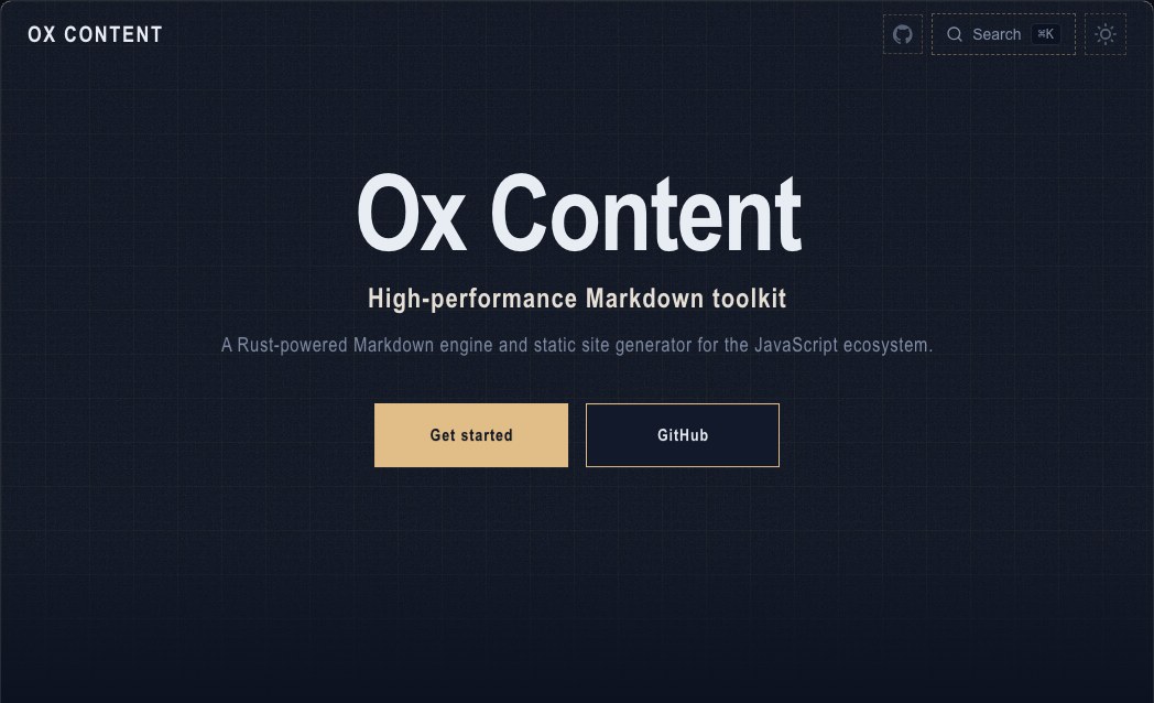 Blueprint
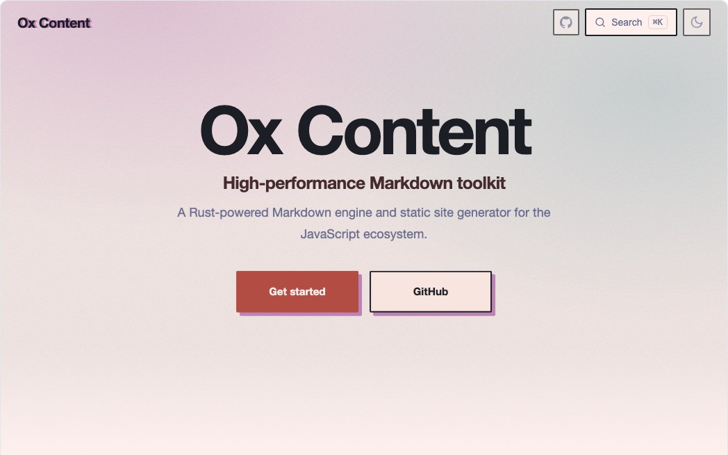 Risograph
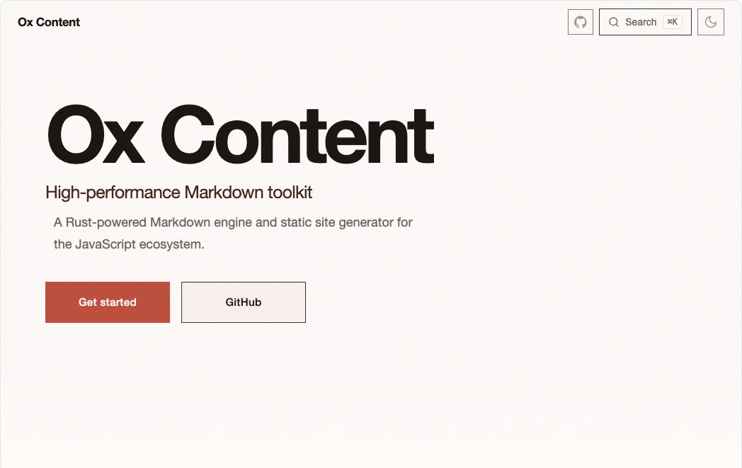 Swiss
Swiss
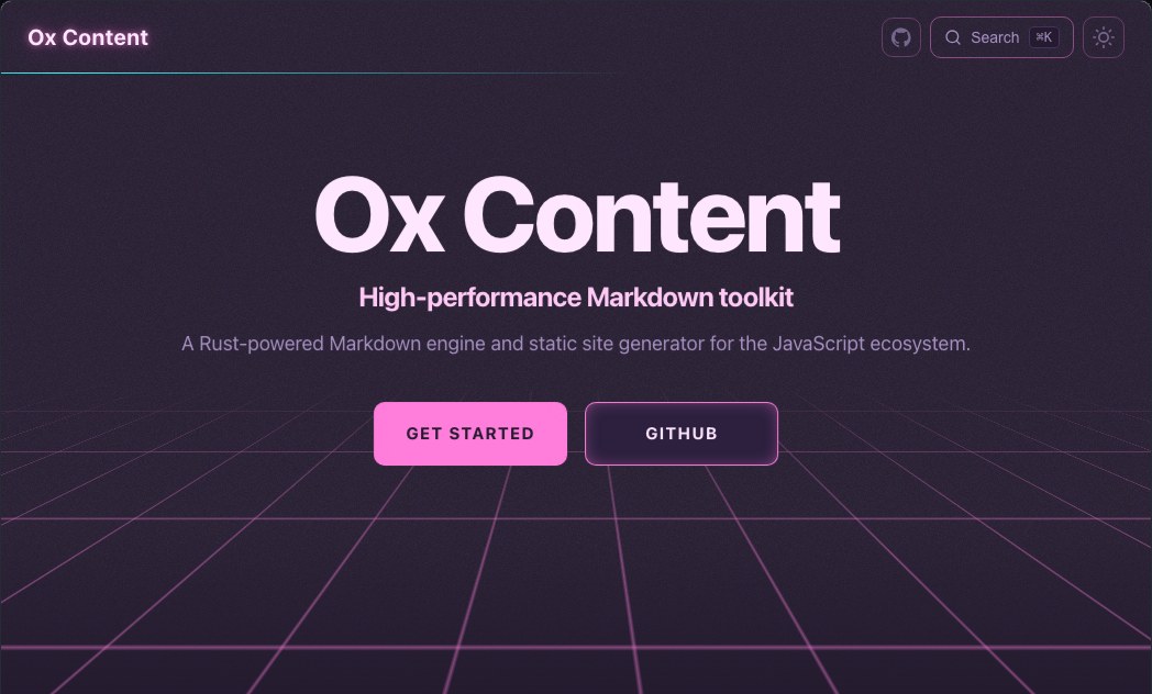 Neon
Neon
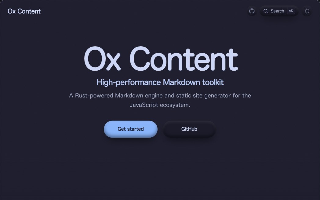 Clay
Clay
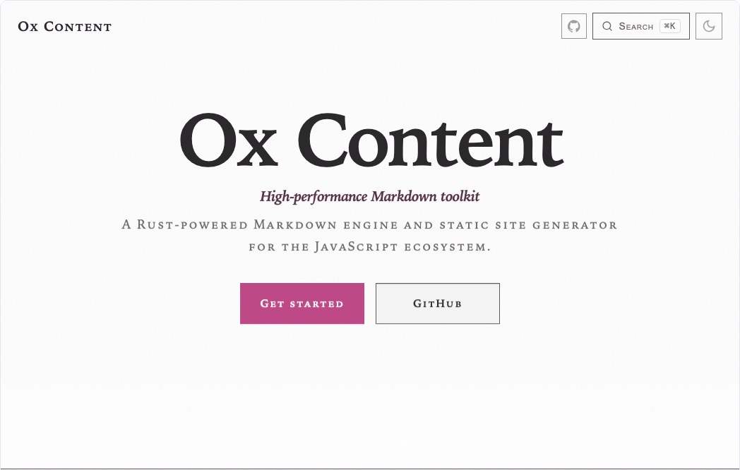 Editorial
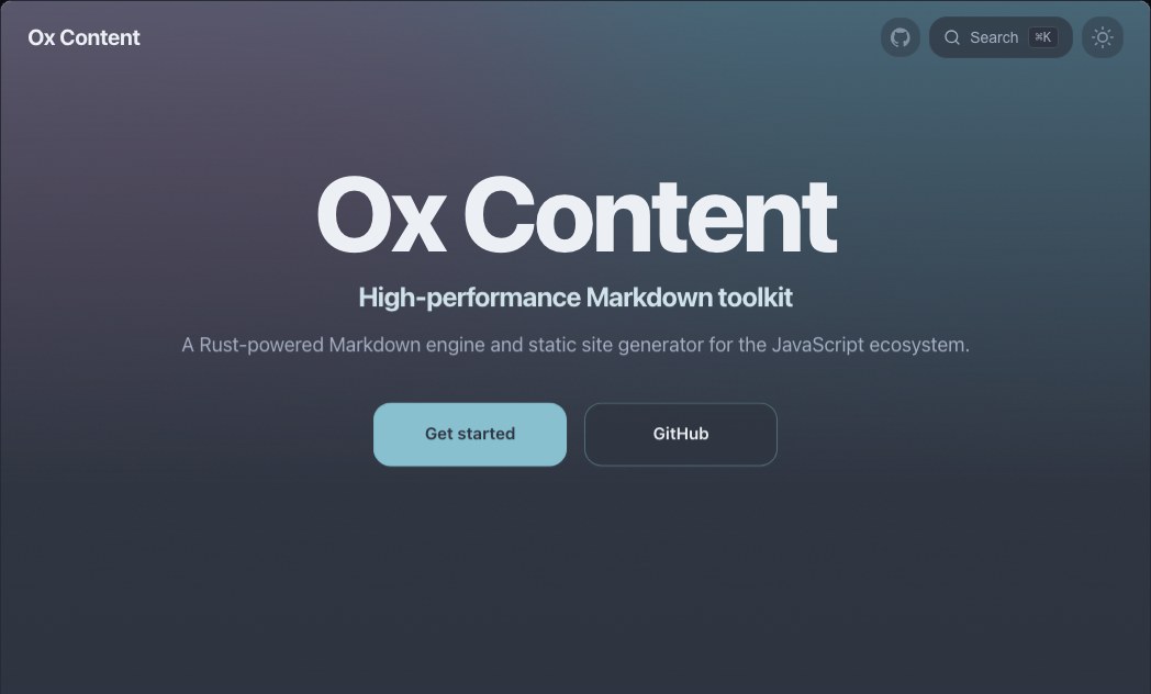 Aurora
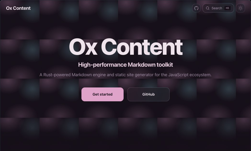 Holo
Holo
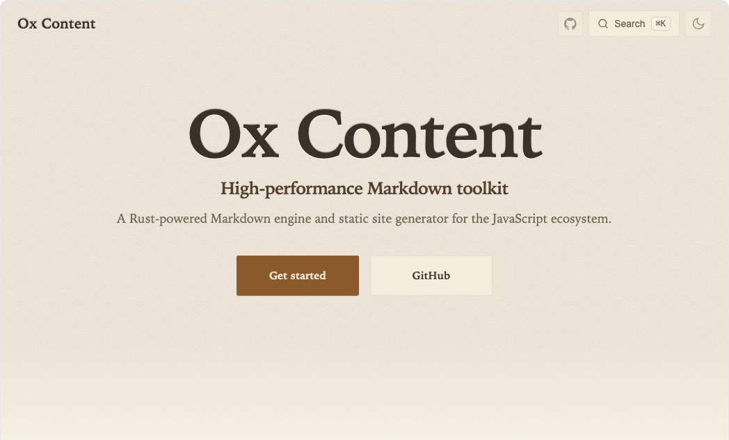 Paper
Paper
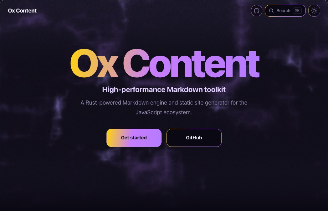 Voltage
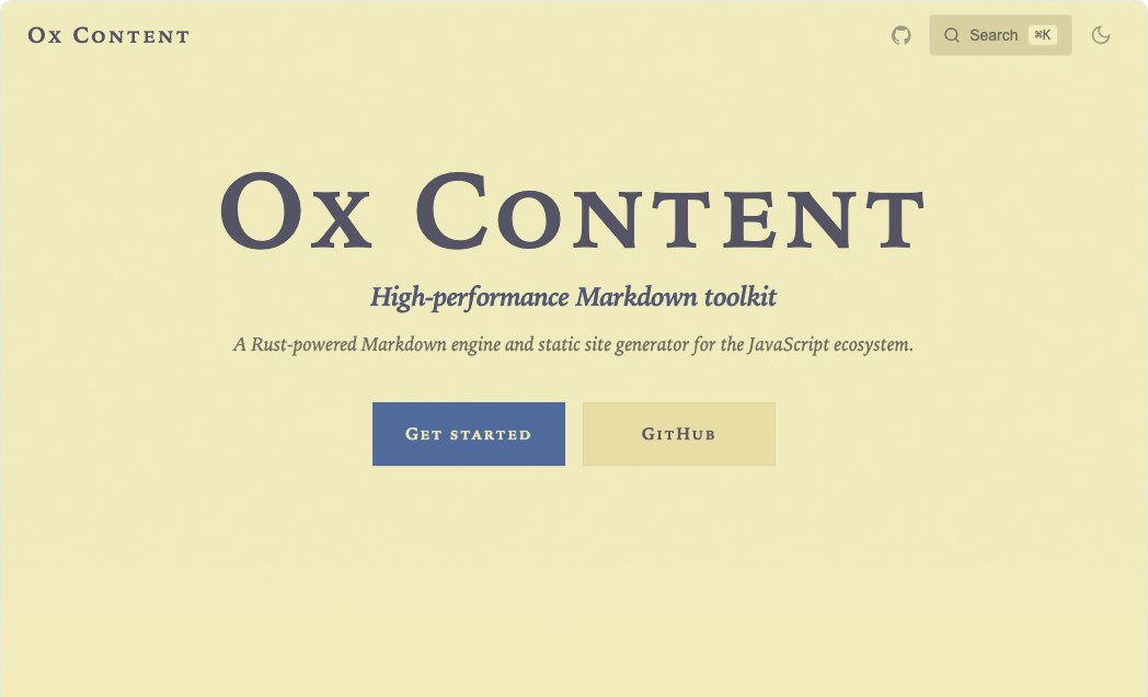 Manuscript
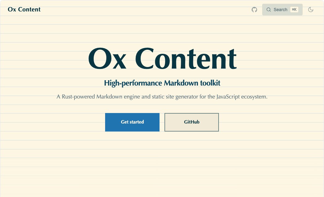 Ledger
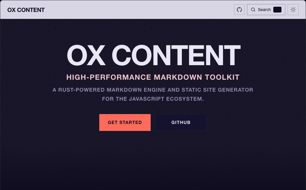 Kiosk
Kiosk
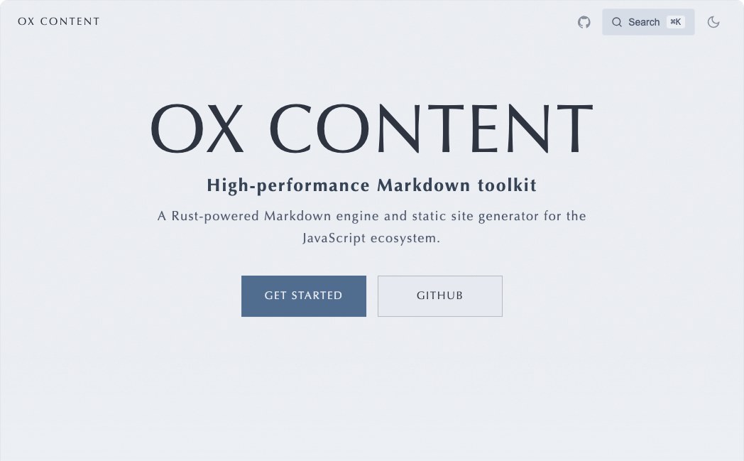 Atlas
Atlas
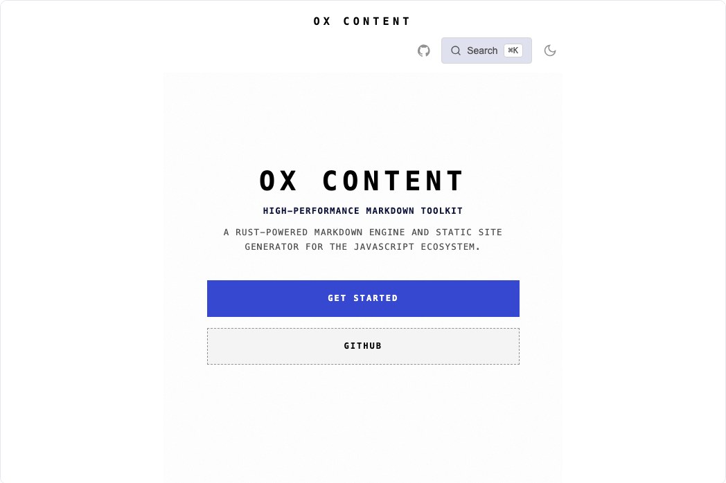 Receipt
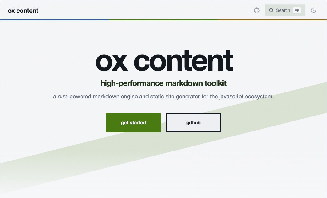 Bauhaus
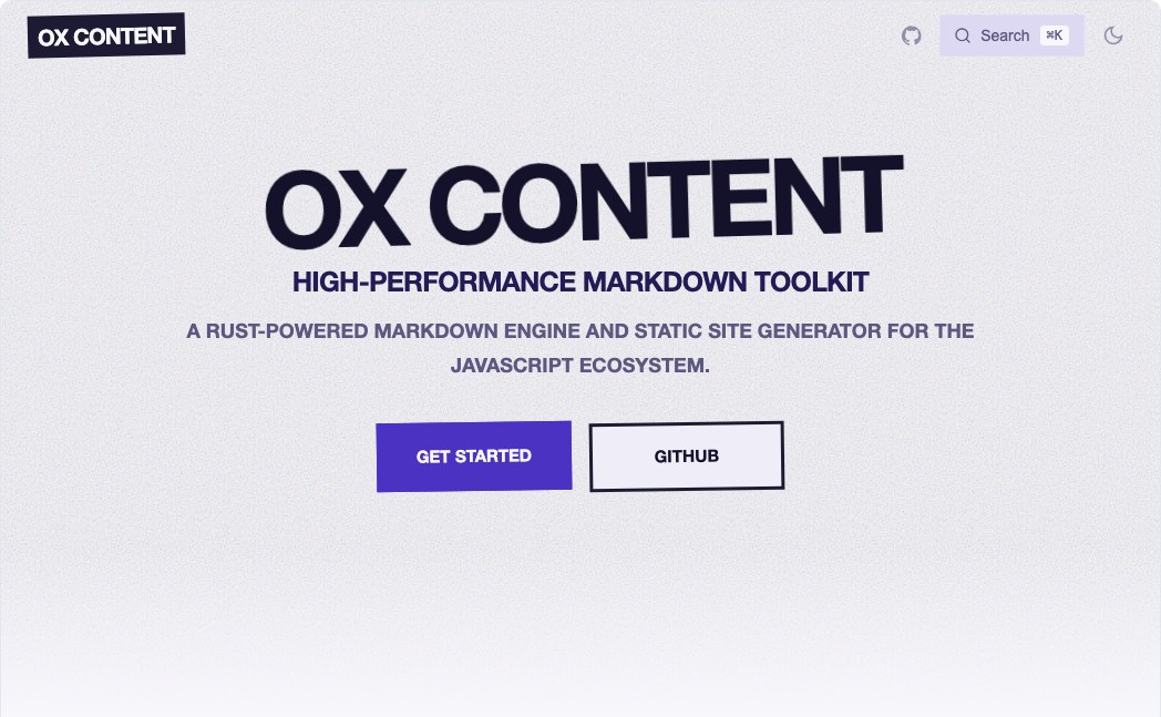 Zine
Zine
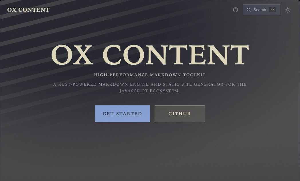 Noir
Noir
クイックスタート#
片方ずつ入れます。
npm install @ox-content/theme-liquid-glass @ox-content/theme-color-tokyo-night
それからレイヤーとして並べます。theme は配列を受け取り、左から右へ合成します。
// vite.config.ts
import { defineConfig } from "vite";
import { oxContent } from "@ox-content/vite-plugin";
import liquidGlass from "@ox-content/theme-liquid-glass";
import tokyoNight from "@ox-content/theme-color-tokyo-night";

export default defineConfig({
  plugins: [
    oxContent({
      srcDir: "docs",
      ssg: {
        siteName: "My Docs",
        theme: [liquidGlass, tokyoNight],
      },
    }),
  ],
});
あとから足したものが勝つので、自分の上書きは最後です。
theme: [
  liquidGlass,
  tokyoNight,
  {
    colors: { primary: "#ff5f56" },
    footer: { copyright: "Copyright © 2026 My Company" },
  },
];
どちらの軸も単独で使えます。スキンなしの配色は既定テーマの色を変え、配色なしのスキンは既定パレットの形を変えます。
スキン#
各スキンはだいたい 6–7 kB の CSS で、JavaScript はゼロ、実行時依存もありません。
| パッケージ | 名前 | 説明 |
|---|---|---|
@ox-content/theme-pixel |
Pixel | 厚い 8-bit 面、硬いオフセット影、段階的なモーション |
@ox-content/theme-liquid-glass |
Liquid Glass | 屈折するガラスパネル、鏡面エッジ、ホバー時の光の走り |
@ox-content/theme-blur-glass |
Blur Glass | 柔らかい霞から解ける、フロストの backdrop-blur 層 |
@ox-content/theme-analog-film |
Analog Film | 粒状、ハレーション、スプロケットレール、穏やかなゲートウィーブ |
@ox-content/theme-fluid |
Fluid | コンテンツの後ろで漂い変形する、有機的なブロブ勾配 |
@ox-content/theme-fabric |
Fabric | 織り目、縫い目、柔らかい布の折りたたみ |
@ox-content/theme-leather |
Leather | 型押しの粒と鞍縫い。触れると沈む |
@ox-content/theme-brutalist |
Brutalist | 生の構造、巨大な文字、叩きつける影 |
@ox-content/theme-terminal |
Terminal | CRT 蛍光体、スキャンライン、点滅するブロックキャレット、プロンプト余白 |
@ox-content/theme-blueprint |
Blueprint | 製図グリッド、破線の引き出し、自分で描かれるストローク |
@ox-content/theme-risograph |
Risograph | 見当がずれたデュオトーン印刷。ホバーでインクチャンネルが分かれる |
@ox-content/theme-swiss |
Swiss | International Typographic Style — 硬いグリッド、罫、精密なスライド |
@ox-content/theme-neon |
Neon | サンセットグリッドの輝き、唸る管の輪郭、スキャンラインの走り |
@ox-content/theme-clay |
Clay | ポインタの下で潰れる、柔らかい押し出し粘土 |
@ox-content/theme-editorial |
Editorial | ドロップキャップ、ヘアライン罫、カラムの現れを持つ雑誌タイポ |
@ox-content/theme-aurora |
Aurora | 半透明パネルの後ろをゆっくり流れる円錐の光のカーテン |
@ox-content/theme-holo |
Holo | パネルが傾き滑るにつれて色相が変わる虹色箔 |
@ox-content/theme-paper |
Paper | 柔らかい紙への活版の凹みと、ギザギザのページ端 |
@ox-content/theme-voltage |
Voltage | 帯電した勾配エッジと生きた電場を持つ、巨大なディスプレイ文字 |
@ox-content/theme-manuscript |
Manuscript | 写本のページ — 狭い行長、ルブリカの見出し、傍注になる目次 |
@ox-content/theme-ledger |
Ledger | 綴じた帳簿 — 本物の罫線の上に文字、表形式の数字 |
@ox-content/theme-kiosk |
Kiosk | 駅の案内 — 出発案内板のサイドバー、帯見出し、矢印 |
@ox-content/theme-atlas |
Atlas | 測量図 — 等高線帯、凡例サイドバー、レジストレーションマーク |
@ox-content/theme-receipt |
Receipt | 感熱ロール — 狭い中央カラム、点線リーダー、破れた端 |
@ox-content/theme-bauhaus |
Bauhaus | 円、正方形、三角形、グリッドを拒む対角線 |
@ox-content/theme-zine |
Zine | コピーしてテープで留めた — ページに対して何も直角でない |
@ox-content/theme-noir |
Noir | 硬いキーライトと急な落ち込み — 闇から拾い出される形 |
配色#
どの配色も、対になるライト と ダークのパレットを載せます。組み込みヘッダーの切替で、追加設定なしに切り替わります。
すべての配色パッケージを、ライトとダークの対で見られる preview です。各カードはページ背景、本文、リンクアクセント、コード背景、シンタックスアクセントを抜き出しています。組み合わせはギャラリーで試せます。
| パッケージ | 名前 | 説明 |
|---|---|---|
@ox-content/theme-color-github |
GitHub | GitHub Light と GitHub Dark |
@ox-content/theme-color-tokyo-night |
Tokyo Night | Tokyo Night Day と Tokyo Night Storm |
@ox-content/theme-color-mono |
Mono | 純モノクロ、色相ゼロ |
@ox-content/theme-color-dracula |
Dracula | Dracula と Alucard ライト対 |
@ox-content/theme-color-one-dark |
One Dark | Atom One Light と One Dark |
@ox-content/theme-color-retro |
Retro | 暖かいアンバー蛍光体ターミナル |
@ox-content/theme-color-snow |
Snow | 深いスレートの上の、はっきりした雪白 |
@ox-content/theme-color-catppuccin |
Catppuccin | Catppuccin Latte と Mocha |
@ox-content/theme-color-nord |
Nord | Nord Snow Storm と Polar Night |
@ox-content/theme-color-gruvbox |
Gruvbox | Gruvbox ライトとダーク、中コントラスト |
@ox-content/theme-color-rose-pine |
Rosé Pine | Rosé Pine Dawn と Rosé Pine |
@ox-content/theme-color-solarized |
Solarized | Ethan Schoonover の Solarized Light と Dark |
@ox-content/theme-color-everforest |
Everforest | Everforest ライトとダーク、中コントラスト |
@ox-content/theme-color-ayu |
Ayu | Ayu Light と Ayu Mirage |
@ox-content/theme-color-vitesse |
Vitesse | Anthony Fu の Vitesse ライトとダーク |
@ox-content/theme-color-night-owl |
Night Owl | Sarah Drasner の Light Owl と Night Owl |
@ox-content/theme-color-monokai |
Monokai | Monokai Pro とライトの相棒 |
@ox-content/theme-color-kanagawa |
Kanagawa | Kanagawa Lotus と Wave |
@ox-content/theme-color-poimandres |
Poimandres | Poimandres、深い紺の上の冷たいティール |
@ox-content/theme-color-sepia |
Sepia | 長い読書向けに抑えた、低グレアのセピア |
@ox-content/theme-color-high-contrast |
High Contrast | 本文を WCAG AAA に寄せた最大コントラスト |
@ox-content/theme-color-synthwave |
Synthwave | ホットマゼンタアクセントのサンセットグリッド synthwave |
@ox-content/theme-color-voltage |
Voltage | ほぼ黒のキャンバスの上の高電圧アクセント |
@ox-content/theme-color-flexoki |
Flexoki | インクと紙、電子ペーパーのような落ち着き |
@ox-content/theme-color-iceberg |
Iceberg | vim 配色から借りた、冷たく静かな青 |
@ox-content/theme-color-zenburn |
Zenburn | 長い作業向けの、古典的な低コントラスト |
@ox-content/theme-color-oceanic |
Oceanic | Oceanic Next — 深いスレートティール |
@ox-content/theme-color-palenight |
Palenight | Material Palenight — 柔らかいインディゴ |
@ox-content/theme-color-material |
Material | Material Theme Lighter と Material Theme |
@ox-content/theme-color-horizon |
Horizon | 夕暮れの暖かいコーラルとプラム |
@ox-content/theme-color-modus |
Modus | Protesilaos のアクセシビリティ優先配色。全体が WCAG AAA |
@ox-content/theme-color-melange |
Melange | 落ち着いたアース、暖かく急がない |
@ox-content/theme-color-graphite |
Graphite | オフブラックとオフホワイト、電気的なアクセント 1 つ |
@ox-content/theme-color-sand |
Sand | テラコッタを持つ、暖かい中間の石 |
@ox-content/theme-color-moss |
Moss | 深い森と紙のクリーム |
@ox-content/theme-color-slate |
Slate | 電気的なライム端を持つ冷たいグレー |
@ox-content/theme-color-plum |
Plum | ナスとblush |
@ox-content/theme-color-ink |
Ink | 暖かい砂を持つ深い紺 |
@ox-content/theme-color-porcelain |
Porcelain | 控えめな青灰を持つ、柔らかい暖かい白 |
@ox-content/theme-color-cacao |
Cacao | キャラメルを持つ、暖かいダークチョコレート |
@ox-content/theme-color-coral |
Coral | コーラルとティールを持つ、暖かいオフホワイト |
@ox-content/theme-color-arctic |
Arctic | 氷河シアンを持つ冷たい白 |
@ox-content/theme-color-fuji |
Fuji | 山の祭ポスター — 森、夜明けのオレンジ、開いた空 |
@ox-content/theme-color-stage |
Stage | イベントポスター — コーラルとアシッドイエローを持つ深いインディゴ |
@ox-content/theme-color-emerald |
Emerald | 深いスレートの上の鮮やかな緑 — カンファレンスバッジのパレット |
@ox-content/theme-color-commander |
Commander | 昼は CGA シアンパネル、夜は素のコンソールプロンプト |
Shiki migration preset#
Ox Content 3 はネイティブ tree-sitter highlighter だけでコードをハイライトします。Shiki runtime、highlightTheme、TextMate grammar、2 つ目の highlighter は戻しません。下の表は、公式 @shikijs/themes@4.4.3 の theme ID(MIT)を、完全な Ox Content ThemeConfig export に対応させたものです。
各 export はライト/ダークが対になった theme のままです。Shiki 側が片方の mode しか持たない場合は、pairing 列に Ox Content が使う安定した相棒を明記しています。syntax color は Ox Content の semantic role(comment、punctuation、keyword、string、constant、function、parameter、link)に写します。TextMate scope の完全な一致は意図的に対象外です。
| Shiki theme ID | Ox Content package | Export | Pairing | Notes |
|---|---|---|---|---|
github-light |
@ox-content/theme-color-github |
githubClassic |
GitHub Light + GitHub Dark | - |
github-dark |
@ox-content/theme-color-github |
githubClassic |
GitHub Light + GitHub Dark | - |
github-light-default |
@ox-content/theme-color-github |
githubDefault |
GitHub Light Default + GitHub Dark Default | - |
github-dark-default |
@ox-content/theme-color-github |
githubDefault |
GitHub Light Default + GitHub Dark Default | - |
github-dark-dimmed |
@ox-content/theme-color-github |
githubDimmed |
GitHub Light Default + GitHub Dark Dimmed | - |
github-light-high-contrast |
@ox-content/theme-color-github |
githubHighContrast |
GitHub Light High Contrast + GitHub Dark High Contrast | - |
github-dark-high-contrast |
@ox-content/theme-color-github |
githubHighContrast |
GitHub Light High Contrast + GitHub Dark High Contrast | - |
dracula |
@ox-content/theme-color-dracula |
dracula |
Dracula Alucard light companion + Dracula | - |
dracula-soft |
@ox-content/theme-color-dracula |
draculaSoft |
Dracula Alucard light companion + Dracula Soft | Shiki は Dracula 系を dark variant だけで配るため、light side は Ox Content 既存の Alucard companion を使います。 |
one-light |
@ox-content/theme-color-one-dark |
oneDarkPro |
One Light + One Dark Pro | - |
one-dark-pro |
@ox-content/theme-color-one-dark |
oneDarkPro |
One Light + One Dark Pro | - |
catppuccin-latte |
@ox-content/theme-color-catppuccin |
catppuccin |
Catppuccin Latte + Catppuccin Mocha | - |
catppuccin-mocha |
@ox-content/theme-color-catppuccin |
catppuccin |
Catppuccin Latte + Catppuccin Mocha | - |
catppuccin-frappe |
@ox-content/theme-color-catppuccin |
catppuccinFrappe |
Catppuccin Latte + Catppuccin Frappé | - |
catppuccin-macchiato |
@ox-content/theme-color-catppuccin |
catppuccinMacchiato |
Catppuccin Latte + Catppuccin Macchiato | - |
gruvbox-light-medium |
@ox-content/theme-color-gruvbox |
gruvbox |
Gruvbox Light Medium + Gruvbox Dark Medium | - |
gruvbox-dark-medium |
@ox-content/theme-color-gruvbox |
gruvbox |
Gruvbox Light Medium + Gruvbox Dark Medium | - |
gruvbox-light-hard |
@ox-content/theme-color-gruvbox |
gruvboxHard |
Gruvbox Light Hard + Gruvbox Dark Hard | - |
gruvbox-dark-hard |
@ox-content/theme-color-gruvbox |
gruvboxHard |
Gruvbox Light Hard + Gruvbox Dark Hard | - |
gruvbox-light-soft |
@ox-content/theme-color-gruvbox |
gruvboxSoft |
Gruvbox Light Soft + Gruvbox Dark Soft | - |
gruvbox-dark-soft |
@ox-content/theme-color-gruvbox |
gruvboxSoft |
Gruvbox Light Soft + Gruvbox Dark Soft | - |
rose-pine-dawn |
@ox-content/theme-color-rose-pine |
rosePine |
Rosé Pine Dawn + Rosé Pine | - |
rose-pine |
@ox-content/theme-color-rose-pine |
rosePine |
Rosé Pine Dawn + Rosé Pine | - |
rose-pine-moon |
@ox-content/theme-color-rose-pine |
rosePineMoon |
Rosé Pine Dawn + Rosé Pine Moon | - |
solarized-light |
@ox-content/theme-color-solarized |
solarized |
Solarized Light + Solarized Dark | - |
solarized-dark |
@ox-content/theme-color-solarized |
solarized |
Solarized Light + Solarized Dark | - |
ayu-light |
@ox-content/theme-color-ayu |
ayu |
Ayu Light + Ayu Mirage | - |
ayu-mirage |
@ox-content/theme-color-ayu |
ayu |
Ayu Light + Ayu Mirage | - |
ayu-dark |
@ox-content/theme-color-ayu |
ayuDark |
Ayu Light + Ayu Dark | - |
vitesse-light |
@ox-content/theme-color-vitesse |
vitesse |
Vitesse Light + Vitesse Dark | - |
vitesse-dark |
@ox-content/theme-color-vitesse |
vitesse |
Vitesse Light + Vitesse Dark | - |
vitesse-black |
@ox-content/theme-color-vitesse |
vitesseBlack |
Vitesse Light + Vitesse Black | - |
night-owl-light |
@ox-content/theme-color-night-owl |
nightOwl |
Light Owl + Night Owl | - |
night-owl |
@ox-content/theme-color-night-owl |
nightOwl |
Light Owl + Night Owl | - |
kanagawa-lotus |
@ox-content/theme-color-kanagawa |
kanagawa |
Kanagawa Lotus + Kanagawa Wave | - |
kanagawa-wave |
@ox-content/theme-color-kanagawa |
kanagawa |
Kanagawa Lotus + Kanagawa Wave | - |
kanagawa-dragon |
@ox-content/theme-color-kanagawa |
kanagawaDragon |
Kanagawa Lotus + Kanagawa Dragon | - |
material-theme-lighter |
@ox-content/theme-color-material |
material |
Material Theme Lighter + Material Theme | - |
material-theme |
@ox-content/theme-color-material |
material |
Material Theme Lighter + Material Theme | - |
material-theme-darker |
@ox-content/theme-color-material |
materialDarker |
Material Theme Lighter + Material Theme Darker | - |
material-theme-ocean |
@ox-content/theme-color-material |
materialOcean |
Material Theme Lighter + Material Theme Ocean | - |
material-theme-palenight |
@ox-content/theme-color-material |
materialPalenight |
Material Theme Lighter + Material Theme Palenight | - |
horizon |
@ox-content/theme-color-horizon |
horizon |
Ox Content light companion + Horizon | - |
horizon-bright |
@ox-content/theme-color-horizon |
horizonBright |
Horizon Bright + Horizon | - |
シンタックスハイライト#
ハイライトは両モードで配色に従い、追加設定は不要です。ネイティブ tree-sitter ハイライターはトークン色を --octc-syntax-* カスタムプロパティとして出します。各配色がモードごとに定義するので、1 ビルドで 2 パレットです。
配色はページ背景ではなく コード背景 に対してシンタックス色を選びます。いくつかのライト配色(mono、snow、nord、retro、monokai、poimandres、synthwave)は、ライトモードでも意図して暗いコードブロックを残します。固定テーマだと暗いトークン色が乗って読めなくなります。
配色がなければプロパティは GitHub Dark に落ちます。
他のトークンと同じように、個別トークンを上書きできます。
theme: [pixel, tokyoNight, { darkTokens: { "syntax-token-comment": "#5a6a8a" } }];
モーション#
プリセットはモーション優先で、すべて宣言的 CSS です。
- 文書横断のページ遷移 は
@view-transition { navigation: auto }です。ヘッダーとサイドバーにview-transition-nameが付くので、記事が入れ替わるあいだそれらは止まります。ルータもクライアントバンドルもない、アプリのような感触です。 - スクロール駆動の現れ は
animation-timeline: view()です。見出し、コードブロック、表、機能カードは入ってくると上がり、機能グリッドは列でずれます。 - ダイアログ入場 は
@starting-styleです。検索モーダルは、JavaScript でクラスを切り替えなくても開くアニメーションになります。
すべては @supports の後ろにあるので、機能のないエンジンは完成した静的状態を描くだけです。アニメーションしていない状態が隠れた状態になることはありません。すべて prefers-reduced-motion: reduce でオフになります。
CSS を触らずに振付を変えられます。どのスキンもタイミングをトークンとして出します。
| トークン | 目的 |
|---|---|
--octc-motion-fast |
色と背景の遷移 |
--octc-motion-base |
エレベーション、変形、ページ入替 |
--octc-motion-slow |
ヒーロー入場、鏡面の走り |
--octc-motion-ease |
そのスキンの署名イージング曲線 |
--octc-motion-spring |
持ち上げと押し込みのオーバーシュート |
--octc-motion-rise |
現れるブロックが移動する距離 |
theme: [liquidGlass, tokyoNight, { tokens: { "motion-base": "200ms", "motion-ease": "linear" } }];
ライブ背景#
3 つのスキンは、CSS で偽るのではなく GPU でヒーロー背景を描きます。
| スキン | 描くもの |
|---|---|
liquid-glass |
本物の屈折 — パネルごとの rounded-rect SDF が、球面ベベルに沿って手続き壁紙をパネル中心へ曲げ、縁で色収差を分ける |
fluid |
curl-noise 速度場を通って移流する染料。発散ゼロなので、非圧縮の液体として読める |
fabric |
漂うキーライトで照らされた織りの高さ場。糸は自分の方向に沿って光を拾う |
3 つとも手書き WebGL2 で、依存はゼロ です。Three.js もバンドルも、入れるものはありません。テーマ自身の js に入り、SSG が 1 つのインラインスクリプトとして出します。
厳密にプログレッシブエンハンスメントで、次のどれでもページは JavaScript なしの描画のままです。
prefers-reduced-motion: reduce— 起動しない- WebGL2 コンテキストがない、またはシェーダがコンパイルに失敗する — 起動しない
- ヒーローが画面外、またはタブが裏 — 描画を止める
- どんなエラーでも — 飲み込む。下の CSS 背景がデザインだから
色は同じ --octc-* プロパティからライブパレットを読むので、背景は配色に従い、テーマ切替のたびに読み直します。
独自トークン#
tokens と darkTokens は、プレフィックスなしのキーで任意の --octc-* カスタムプロパティをセットします。レイヤー間でキー単位にマージするので、1 つ上書きするために残りを書き直す必要はありません。
theme: [
  liquidGlass,
  tokyoNight,
  {
    tokens: { "surface-glass": "#f8fafc", "code-line-add": "rgba(0,200,120,.18)" },
    darkTokens: { "surface-glass": "#0c1324" },
  },
];
トークン名はビルド時に検証されます。宣言ブロックの外へ出られる名前は、壊れたスタイルシートを出す代わりにビルドを落とします。
合成の仕組み#
resolveTheme は各レイヤーの extends 鎖を平坦化し、結果をマージします。
- オブジェクトフィールド(
colors、tokens、layout、fonts、…)は キー単位 にマージし、最後のレイヤーが勝ちます。 cssとjsはレイヤー順で 連結 します。上書きするとスキン + 配色スタックの半分が消えます。同じ断片は一度だけつなぐので、配列とextendsの両方から届いたレイヤーは二重に出ません。
だからスキンは面の変数を生の css ではなく tokens で宣言します。トークンはスタイルシートが走る前に宣言的に解決するので、パッケージを並べる順に結果が依存しません。
パッケージを書く#
プリセットはプレーンな ThemeConfig です。実装するプラグイン API はありません。スキンは css、fonts、layout、モーション tokens をセットし、配色は colors、darkColors、tokens、darkTokens をセットします。新しいパッケージは、公開済みの他レイヤーと合成できるよう、下の互換契約を満たす必要があります。
互換性#
- ライトとダーク。 配色は
colorsとdarkColorsの両方を持つThemeConfig(default または named)を export する必要があります。必須パレットキー:primary、background、text、textMuted、border、codeBackground、codeText。カタログ配色はprimaryHoverとbackgroundAltも載せます。 - 必須シンタックストークン。 配色は
tokensとdarkTokensの下に、ハイライタートークンを定義する必要があります。少なくともsyntax-foreground、syntax-background、いくつかのsyntax-token-*キー。これらは@ox-content/theme-color-*パッケージが解決する--octc-syntax-*カスタムプロパティになります。 - スキンは色をハードコードしてはいけない。 スキンが持つのは形であり、パレットではありません。
ThemeConfig.colors/darkColorsに hex や rgb を置かないでください。CSS 変数と、色フィールドの省略は構いません。cssでは--octc-color-*と--octc-accent-*を参照し、色合いにはcolor-mix()を使います。奥行きのための中立の黒 / 白アルファは構いません。 - 左から右へ合成。
ssg.themeにレイヤーを配列で並べます。オブジェクトフィールドはキー単位にマージし、cssとjsは連結します。後のレイヤーが勝ちます。 - スクリーンショット。 上のギャラリー向けに、スキン(または代表的な組み合わせ)のスクリーンショットを含めてください。
import { defineTheme } from "@ox-content/vite-plugin";

export default defineTheme({
  name: "my-skin",
  fonts: { sans: "Inter, system-ui, sans-serif" },
  tokens: { "motion-base": "260ms", "motion-ease": "cubic-bezier(.2,0,0,1)" },
  css: `.header { border-bottom: 2px solid var(--octc-color-primary); }`,
});
デフォルトテーマの品質#
組み込みスタイルシート(ssg.css)が、すべてのスキンと配色が乗る品質の下限です。値をハードコードする代わりに、次のトークンを上書きしてください。
| トークン | 役割 |
|---|---|
--octc-focus-ring / --octc-focus-offset |
共有の :focus-visible リング |
--octc-motion-base / --octc-motion-ease |
既定のモーション。prefers-reduced-motion では無効 |
--octc-code-pad-* / --octc-table-cell-pad-* |
コード枠と表セルの余白 |
--octc-touch-target |
モバイルナビのヒット領域 |
--octc-color-on-primary |
ブランド塗りつぶし上の文字(ヒーロー、告知バー) |
--octc-color-tip / --octc-color-warning / --octc-color-danger |
ステータス用クローム |
html のスムーススクロールは prefers-reduced-motion: no-preference のときだけ有効です。コード行のぼかしとナビのシェブロン遷移は、モーション低減時に切れます。PR ベンチマークはデフォルトテーマの CSS/JS サイズを出し続けます。クロームを足すより、これらのトークンを調整してください。
ここでの対象外: セルフホストフォント、Iconify CSS、tweet / full-card の見た目、印刷用スタイルシート、スキンごとのギャラリースクショ更新。回帰したら個別の follow-up として切ってください。